Forms overview
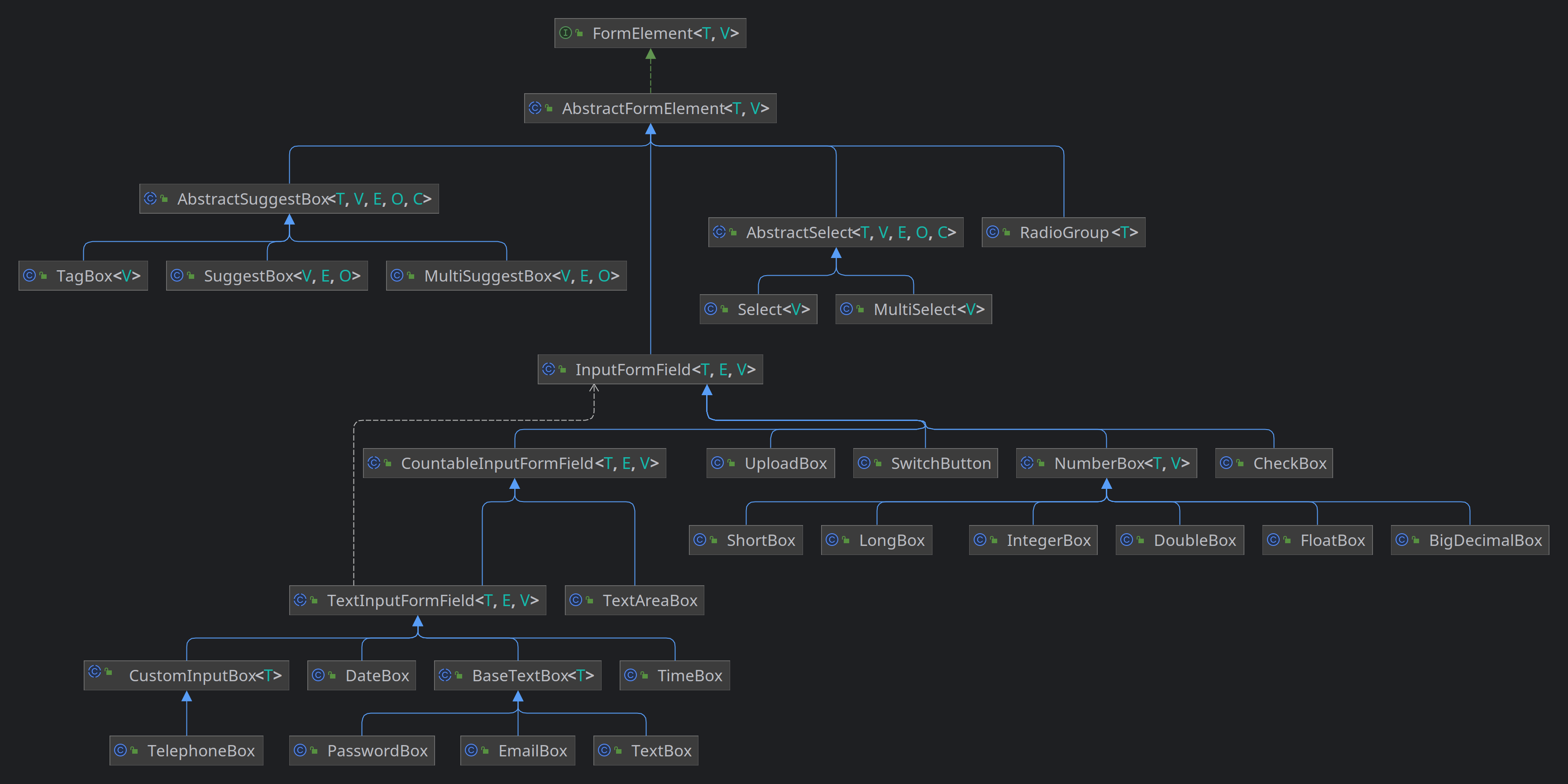
In this overview, we aim to outline the various built-in form elements offered by Domino-ui. We'll illustrate the hierarchical relationship between these elements and offer a concise insight into each component.
-
AbstractFormElement
An abstract base class for form elements in the Domino UI framework.AbstractFormElement provides common functionality for form elements, including validation, error handling, labeling, and more. It can be extended to create specific form elements with custom behavior.
Usage Example:
 // Create a custom form element by extending AbstractFormElement
 public class MyCustomFormElement extends AbstractFormElement< MyCustomFormElement, String>  {

     public MyCustomFormElement() {
         // Initialize and configure the form element
         // ...
     }

     // Implement any additional methods and behaviors specific to your custom form element
     // ...
 }
T
The concrete form element type.
V
The type of the form element's value.
See also :
-
AbstractSuggestBox
An abstract base class for suggest box elements that provides common functionality and UI components.This class allows the creation of suggest boxes for selecting options from a list of suggestions. It provides features like auto-suggest, delayed text input, and a drop-down menu for selecting options.
Usage Example:
 // Create a suggest box with a custom SuggestionsStore
 SuggestionsStore< MyData, IsElement< ?>>  suggestionsStore = createCustomSuggestionsStore();
 MySuggestBox suggestBox = new MySuggestBox(suggestionsStore);
 suggestBox.setPlaceholder("Search..."); suggestBox.setAutoSelect(true);
 suggestBox.setTypeAheadDelay(500); suggestBox.addSelectionListener(selectedOption ->  { MyData
 selectedData = selectedOption.getValue(); // Handle the selected data });
T
The data type of the suggest options.
V
The value type of the suggest box.
E
The type of the suggest box's element, usually an IsElement .
O
The type of options that can be selected in the suggest box.
C
The concrete suggest box implementation type.
-
MultiSuggestBox
A multi-select suggestion box that allows users to select multiple options from a list of suggestions.V
The type of data associated with the selected options.
E
The type of the suggest box's element.
O
The type of the option within the suggest box.
-
SuggestBox
A single-select suggestion box that allows users to select an option from a list of suggestions.V
The type of data associated with the selected option.
E
The type of the suggest box's element.
O
The type of the option within the suggest box.
-
TagBox
A versatile input field that allows users to select multiple tags from a list of suggestions.V
The type of data associated with the selected tags.
-
-
AbstractSelect
Represents an abstract select form element which can be used as a base for building dropdown selectors. This abstract class encapsulates common behavior and rendering logic shared by various select components.Usage:
 // Create a concrete class extending AbstractSelect
 public class MySelect extends AbstractSelect< MyType, String, MyElement, MyOption, MySelect>  {
      // implementation details...
 }
 MySelect select = new MySelect();
T
The type of the model.
V
The type of the value to be selected.
E
The type of the element.
O
The type of the option.
C
The type of the concrete class extending this abstract class.
-
MultiSelect
Represents a multi-selection dropdown menu UI component, allowing users to select multiple options.Usage example:
 MultiSelect< String>  multiSelect = MultiSelect.create("Select Items");
 multiSelect.withValue("Option1", "Option2");
V
the type of the value represented by each selectable option
See also :
-
Select
Represents a dropdown select control allowing the user to choose a single option from a list.Usage example:
 Select< String>  fruitSelect = Select.create("Choose a fruit");
 fruitSelect.withOption(new SelectOption<> ("Apple"), false);
 fruitSelect.withOption(new SelectOption<> ("Banana"), false);
V
The type of value associated with each select option.
See also :
-
-
InputFormField
An abstract base class for input form fields in Domino UI. InputFormField represents form fields that accept user input through an HTML input element.T
The concrete type of the InputFormField.
E
The type of the HTML input element.
V
The type of the input field's value.
See also :
-
CountableInputFormField
The CountableInputFormField class is an abstract class that extends the InputFormField class and provides functionality for input fields with character counters, minimum and maximum lengths, and placeholders.Usage Example:
 // Create a CountableInputFormField for text input
 CountableInputFormField< TextBox, HTMLInputElement, String>  inputField =
     new TextBox()
         .setPlaceholder("Enter text")
         .setMaxLength(100)
         .setMinLength(5)
         .withCounterElement();

 // Set a custom count formatter
 inputField.setCountFormatter((count, maxCount) ->  count + " / " + maxCount);
T
The type of the implementing subclass.
E
The type of the HTML element.
V
The type of the field's value.
-
TextInputFormField
The TextInputFormField class is an abstract class that extends the CountableInputFormField class and provides functionality for text input fields, including prefixes, postfixes, and pattern validation.Usage Example:
 // Create a TextInputFormField for text input
 TextInputFormField< TextBox, HTMLInputElement, String>  inputField =
     new TextBox()
         .setPlaceholder("Enter text")
         .setPattern("[A-Za-z0-9]+", "Only alphanumeric characters are allowed.")
         .withPrefixElement()
         .setPrefix("Prefix: ")
         .withPostfixElement()
         .setPostfix("Postfix");
T
The type of the implementing subclass.
E
The type of the HTML element.
V
The type of the field's value.
-
BaseTextBox
Represents a base text box component that provides foundational behaviors and attributes for text input form fields.Usage example:
 BaseTextBox< ?>  boxWithoutLabel = new BaseTextBox<> ();
 BaseTextBox< ?>  boxWithLabel = new BaseTextBox<> ("Input Label:");
T
the type of the implementing class, used for method chaining
See also :
-
EmailBox
Represents an email input form field with optional data list support for autocompletion. This class extends from BaseTextBox and implements the HasInputDataList interface.Usage example:
 EmailBox defaultEmailBox = new EmailBox();
 EmailBox labeledEmailBox = new EmailBox("Enter your email:");
See also :
-
TextBox
Represents a text input form field. This class extends from BaseTextBox and provides a simple way to handle text input.Usage example:
 TextBox defaultTextBox = new TextBox();
 TextBox labeledTextBox = new TextBox("Enter some text:");
See also :
-
PasswordBox
Represents a password input form field. This class extends from BaseTextBox and is specifically tailored for password input.Usage example:
 PasswordBox defaultPasswordBox = PasswordBox.create();
 PasswordBox labeledPasswordBox = PasswordBox.create("Enter your password:");
See also :
-
-
CustomInputBox
Represents a customizable input box that can be associated with a list of pre-defined options.Usage example:
 CustomInputBox customInput = new CustomInputBox("Label");
 customInput.setType("text");
T
the type of the derived class, used for method chaining
-
TelephoneBox
Represents a telephone input box that accepts telephone numbers.Usage example:
 TelephoneBox boxWithoutLabel = TelephoneBox.create();
 TelephoneBox boxWithLabel = TelephoneBox.create("Phone Number:");
See also :
-
-
DateBox
DateBox is a custom form field for date input with various configuration options. It utilizes a popover with a calendar picker for selecting dates.Usage example:
DateBox dateBox = DateBox.create("Birth date); -
TimeBox
Represents a time input form field with the capability to pick a time.Usage example:
 TimeBox defaultTimeBox = TimeBox.create();
 TimeBox labeledTimeBox = TimeBox.create("Choose a time:");
See also :
-
-
TextAreaBox
The TextAreaBox class is a form field component for text areas, providing features such as prefix and postfix elements, auto-sizing, and value adjustments.Usage Example:
 // Create a TextAreaBox with auto-sizing
 TextAreaBox textArea = TextAreaBox.create().autoSize().setRows(4);

 // Create a TextAreaBox with a label
 TextAreaBox labeledTextArea = TextAreaBox.create("Comments");
See also :
-
-
CheckBox
Represents a checkbox input field that allows users to select or deselect an option.Example usage:
 CheckBox checkBox = CheckBox.create("Enable feature")
      .setChecked(true)
      .onChange(value ->  DomGlobal.console.log("Checkbox state changed: " + value));
See also :
-
NumberBox
An abstract representation of a number input field with various customizations such as min/max values, prefix/postfix elements, and input validation.Usage example:
 NumberBox< Double, Double>  ageBox = new NumberBox<> ("Age");
 ageBox.setMinValue(0.0);
 ageBox.setMaxValue(150.0);
T
Concrete type of the NumberBox
V
Value type (Number subclass) that this NumberBox supports
-
LongBox
A specialized NumberBox for handling long integer values. -
IntegerBox
A specialized NumberBox for handling integer values. -
DoubleBox
A specialized NumberBox for handling double-precision floating point values. -
ShortBox
A specialized NumberBox for handling short integer values. -
FloatBox
A specialized NumberBox for handling floating-point values. -
BigDecimalBox
A specialized NumberBox for handling arbitrary-precision decimal values. This box allows for input and representation of BigDecimal values.
-
-
SwitchButton
A customizable SwitchButton component.This component provides a switchable button that can be toggled between ON and OFF states.
 Usage:
 SwitchButton button = SwitchButton.create("Label", "Off", "On");
See also :
-
UploadBox
The UploadBox class represents an input field for uploading files. It extends the InputFormField class and provides the ability to select and display uploaded files.Usage Example:
// Create an UploadBox with a label UploadBox uploadBox = UploadBox.create("Choose Files:"); // Set the accepted file types (e.g., images) uploadBox.setAccepts("image/*"); // Enable multiple file selection uploadBox.setMultiple(true); // Add a change listener to handle file selection changes uploadBox.addChangeHandler(event -> { ListselectedFiles = event.getTarget().getValue(); // Handle the selected files });
-
-
RadioGroup
Represents a group of radio buttons, ensuring that only one radio button in the group can be selected at a time.This implementation guarantees that radio buttons belonging to the same group have the same name attribute. It provides an API for managing the radio buttons as a group and ensures that selecting one radio deselects others in the same group.
T
The type of the value associated with the radio buttons in the group.
-
API Docs: AbstractFormElement
Constructors
public void AbstractFormElement()
Public methods
public HTMLFieldSetElement element()
Returns:
The HTML fieldset element representing the form element.
public T labelForId(String id)
id
The ID of the HTML element to associate with the label.
Returns:
This form element instance.
public T groupBy(FieldsGrouping fieldsGrouping)
fieldsGrouping
The FieldsGrouping instance to group this form element with.
Returns:
This form element instance.
public T ungroup(FieldsGrouping fieldsGrouping)
fieldsGrouping
The FieldsGrouping instance to ungroup this form element from.
Returns:
This form element instance.
public T appendChild(PrefixAddOn<?> addon)
addon
The prefix add-on to append.
Returns:
This form element instance.
public T appendChild(PostfixAddOn<?> addon)
addon
The postfix add-on to append.
Returns:
This form element instance.
public T setAutoValidation(boolean autoValidation)
autoValidation
True to enable auto-validation, false to disable it.
Returns:
This form element instance.
public boolean isAutoValidation()
Returns:
True if auto-validation is enabled, false otherwise.
public T autoValidate()
Returns:
This form element instance.
public T pauseValidations()
Returns:
This form element instance.
public T resumeValidations()
Returns:
This form element instance.
public boolean isValidationsPaused()
Returns:
True if validations are paused, false otherwise.
public T togglePauseValidations(boolean toggle)
toggle
True to pause validations, false to resume them.
Returns:
This form element instance.
public T pauseFocusValidations()
Returns:
This form element instance.
public T resumeFocusValidations()
Returns:
This form element instance.
public T togglePauseFocusValidations(boolean toggle)
toggle
True to pause focus validations, false to resume them.
Returns:
This form element instance.
public boolean isFocusValidationsPaused()
Returns:
True if focus validations are paused, false otherwise.
public T setHelperText(String helperText)
helperText
The helper text to set.
Returns:
This form element instance.
public String getHelperText()
Returns:
The helper text of this form element.
public T setLabel(String label)
label
The label to set.
Returns:
This form element instance.
public String getLabel()
Returns:
The label of this form element.
public T setLabelFloatLeft(boolean floatLeft)
floatLeft
True to make the label float to the left, false otherwise.
Returns:
This form element instance.
public ValidationResult validate(T formElement)
formElement
The form element to validate.
Returns:
The validation result.
public Set<Validator<T>> getValidators()
Returns:
The set of validators.
public T invalidate(String errorMessage)
errorMessage
The error message to display.
Returns:
This form element instance.
public T invalidate(List<String> errorMessages)
errorMessages
The list of error messages to display.
Returns:
This form element instance.
public List<String> getErrors()
Returns:
The list of error messages.
public T clearInvalid()
Returns:
This form element instance.
public T setRequired(boolean required)
required
True to make this form element required, false otherwise.
Returns:
This form element instance.
public T setShowRequiredIndicator(boolean state)
state
True to show the required indicator, false to hide it.
Returns:
This form element instance.
public boolean isShowRequiredIndicator()
Returns:
True if the required indicator is shown, false otherwise.
public T setRequired(boolean required, String message)
required
True to make this form element required, false otherwise.
message
The custom error message to display when the field is required.
Returns:
This form element instance.
public boolean isRequired()
Returns:
True if this form element is required, false otherwise.
public T setRequiredErrorMessage(String requiredErrorMessage)
requiredErrorMessage
The required error message.
Returns:
This form element instance.
public String getRequiredErrorMessage()
Returns:
The required error message.
public void showErrors(List<EditorError> errors)
errors
The list of EditorError instances.
public T fixErrorsPosition(boolean fixErrorsPosition)
fixErrorsPosition
True to fix error messages in position, false otherwise.
Returns:
This form element instance.
public T pauseChangeListeners()
Returns:
This form element instance.
public T resumeChangeListeners()
Returns:
This form element instance.
public Set<ChangeListener<? super V>> getChangeListeners()
Returns:
The set of change listeners.
public boolean isChangeListenersPaused()
Returns:
True if change listeners are paused, false otherwise.
public T togglePauseChangeListeners(boolean toggle)
toggle
True to pause change listeners, false to resume them.
Returns:
This form element instance.
public T pauseClearListeners()
Returns:
This form element instance.
public T resumeClearListeners()
Returns:
This form element instance.
public T togglePauseClearListeners(boolean toggle)
toggle
True to pause clear listeners, false to resume them.
Returns:
This form element instance.
public Set<ClearListener<? super V>> getClearListeners()
Returns:
The set of clear listeners.
public boolean isClearListenersPaused()
Returns:
True if clear listeners are paused, false otherwise.
public T setEmptyAsNull(boolean emptyAsNull)
emptyAsNull
True to treat empty values as null, false otherwise.
Returns:
This form element instance.
public boolean isEmptyAsNull()
Returns:
True if empty values are treated as null, false otherwise.
public T setDefaultValue(V defaultValue)
defaultValue
The default value to set.
Returns:
This form element instance.
public V getDefaultValue()
Returns:
The default value.
public DivElement getBodyElement()
Returns:
The body element.
public LabelElement getLabelElement()
Returns:
The label element.
public DivElement getWrapperElement()
Returns:
The wrapper element.
public DivElement getMessagesWrapperElement()
Returns:
The messages wrapper element.
public SpanElement getHelperTextElement()
Returns:
The helper text element.
public T withBody(ChildHandler<T, DivElement> handler)
handler
The child handler to apply.
Returns:
This form element instance.
public T withLabel()
Returns:
This form element instance.
public T withLabel(ChildHandler<T, LabelElement> handler)
handler
The child handler to apply.
Returns:
This form element instance.
public T withWrapper(ChildHandler<T, DivElement> handler)
handler
The child handler to apply.
Returns:
This form element instance.
public T withMessagesWrapper()
Returns:
This form element instance.
public T withMessagesWrapper(ChildHandler<T, DivElement> handler)
handler
The child handler to apply.
Returns:
This form element instance.
public T withHelperText()
Returns:
This form element instance.
public T withHelperText(ChildHandler<T, SpanElement> handler)
handler
The child handler to apply.
Returns:
This form element instance.
public LazyChild<DominoElement<HTMLElement>> requiredElement()
Returns:
The required element.
public LazyChild<DivElement> messagesWrapper()
Returns:
The messages wrapper element.
public LazyChild<LabelElement> labelElement()
Returns:
The label element.
API Docs: AbstractSuggestBox
Constructors
public void AbstractSuggestBox(SuggestionsStore<T, E, O> store)
AbstractSuggestBox with the specified suggestions store.
store
The suggestions store providing data for the suggest box.
Public methods
public boolean isAutoSelect()
Returns:
true if auto-select is enabled, false otherwise.
public C setAutoSelect(boolean autoSelect)
autoSelect
true to enable auto-select, false to disable it.
Returns:
The concrete suggest box instance.
public int getTypeAheadDelay()
Returns:
The type-ahead delay in milliseconds.
public void setTypeAheadDelay(int typeAheadDelayInMillis)
typeAheadDelayInMillis
The type-ahead delay in milliseconds.
public String getPlaceholder()
Returns:
The placeholder text.
public C setPlaceholder(String placeholder)
placeholder
The placeholder text to set.
Returns:
The suggest box instance.
public DominoElement<HTMLInputElement> getInputElement()
Returns:
The input element.
public DivElement getFieldInput()
Returns:
the input element wrapper element of the suggest box
public C withFieldInputWrapper(ChildHandler<C, DivElement> handler)
handler
function to apply
Returns:
same suggestbox instance
public C focus()
Returns:
The suggest box instance.
public C unfocus()
Returns:
The suggest box instance.
public boolean isFocused()
Returns:
true if the suggest box is focused, false otherwise.
public boolean isEmpty()
Returns:
true if the suggest box is empty, false otherwise.
public boolean isEmptyIgnoreSpaces()
Returns:
true if the suggest box is empty or contains only spaces, false otherwise.
public boolean isEnabled()
Returns:
true if the suggest box is enabled, false if disabled.
public C clear()
Returns:
The suggest box instance after clearing the value.
public C clear(boolean silent)
silent
true to clear the value silently, false to trigger change listeners.
Returns:
The suggest box instance after clearing the value.
public AutoValidator createAutoValidator(ApplyFunction autoValidate)
autoValidate
The auto-validation function to apply.
Returns:
An AutoValidator instance.
public C triggerChangeListeners(V oldValue, V newValue)
oldValue
The old value before the change.
newValue
The new value after the change.
Returns:
The suggest box instance.
public C triggerClearListeners(V oldValue)
oldValue
The old value before clearing.
Returns:
The suggest box instance.
public String getName()
Returns:
The name of the input element.
public C setName(String name)
name
The name to set for the input element.
Returns:
The suggest box instance after setting the name.
public String getType()
Returns:
The input element type ("text").
public C withValue(V value)
value
The value to set.
Returns:
The suggest box instance after setting the value.
public C withValue(V value, boolean silent)
value
The value to set.
silent
true to set the value silently, false to trigger change listeners.
Returns:
The suggest box instance after setting the value.
public void setValue(V value)
value
The value to set.
public C setClearable(boolean clearable)
clearable
true to make the suggest box clearable, false otherwise.
Returns:
The suggest box instance after setting clearability.
public boolean isClearable()
Returns:
true if the suggest box is clearable, false otherwise.
public C setAutoCloseOnSelect(boolean autoClose)
autoClose
true to auto-close the options menu on selection, false otherwise.
Returns:
The suggest box instance after configuring auto-closing behavior.
public boolean isAutoCloseOnSelect()
Returns:
true if auto-closing is enabled, false otherwise.
public Menu<T> getOptionsMenu()
Returns:
The options menu.
public C withOptionsMenu(ChildHandler<C, Menu<T>> handler)
handler
A handler for configuring the suggest box and options menu.
Returns:
The suggest box instance after configuring the options menu.
public C setLoader(Loader loader)
loader
Returns:
same component instance
public C withLoader(ChildHandler<C, Loader> handler)
handler
Returns:
same component instance
public C withLoaderElement(ChildHandler<C, PrimaryAddOn<HTMLElement>> handler)
handler
Returns:
same component instance
API Docs: SuggestBox
Constructors
public void SuggestBox(SuggestionsStore<V, E, O> store)
store
The SuggestionsStore that provides suggestions for this single-select suggest box.
public void SuggestBox(String label, SuggestionsStore<V, E, O> store)
label
The label to display for the single-select suggest box.
store
The SuggestionsStore that provides suggestions for this single-select suggest box.
Static methods
public static SuggestBox<V, E, O> create(SuggestionsStore<V, E, O> store)
store
The SuggestionsStore that provides suggestions for this single-select suggest box.
Returns:
A new instance of SuggestBox.
public static SuggestBox<V, E, O> create(String label, SuggestionsStore<V, E, O> store)
label
The label to display for the single-select suggest box.
store
The SuggestionsStore that provides suggestions for this single-select suggest box.
Returns:
A new instance of SuggestBox.
Public methods
public V getValue()
Returns:
The selected value.
public void onOptionSelected(O option)
option
The suggestion option that was selected.
public SuggestBox<V, E, O> withOption(O option)
option
The suggestion option to add.
Returns:
The updated SuggestBox instance.
public SuggestBox<V, E, O> withOption(O option, boolean silent)
option
The suggestion option to add.
silent
Whether to trigger change listeners silently.
Returns:
The updated SuggestBox instance.
public void onOptionDeselected(O option)
option
The suggestion option that was deselected.
public String getStringValue()
Returns:
The string representation of the selected value.
API Docs: MultiSuggestBox
Constructors
public void MultiSuggestBox(SuggestionsStore<V, E, O> store)
store
The SuggestionsStore that provides suggestions for this multi-select suggest box.
public void MultiSuggestBox(String label, SuggestionsStore<V, E, O> store)
label
The label to display for the multi-select suggest box.
store
The SuggestionsStore that provides suggestions for this multi-select suggest box.
Static methods
public static MultiSuggestBox<V, E, O> create(SuggestionsStore<V, E, O> store)
V
The type of data associated with the selected options.
E
The type of the suggest box's element.
O
The type of the option within the suggest box.
store
The SuggestionsStore that provides suggestions for this multi-select suggest box.
Returns:
A new instance of MultiSuggestBox.
public static MultiSuggestBox<V, E, O> create(String label, SuggestionsStore<V, E, O> store)
V
The type of data associated with the selected options.
E
The type of the suggest box's element.
O
The type of the option within the suggest box.
label
The label to display for the multi-select suggest box.
store
The SuggestionsStore that provides suggestions for this multi-select suggest box.
Returns:
A new instance of MultiSuggestBox.
Public methods
public List<V> getValue()
Returns:
A list of selected values.
public void onOptionSelected(O option)
option
The suggestion option that was selected.
public MultiSuggestBox<V, E, O> withOption(O option)
option
The suggestion option to add.
Returns:
The updated MultiSuggestBox instance.
public MultiSuggestBox<V, E, O> withOption(O option, boolean silent)
option
The suggestion option to add.
silent
Whether to trigger change listeners silently.
Returns:
The updated MultiSuggestBox instance.
public void onOptionDeselected(O option)
option
The suggestion option that was deselected.
public String getStringValue()
Returns:
A comma-separated string of selected values.
API Docs: TagBox
Constructors
public void TagBox(SuggestionsStore<V, Chip, TagOption<V>> store)
store
The SuggestionsStore that provides suggestions for this TagBox.
public void TagBox(String label, SuggestionsStore<V, Chip, TagOption<V>> store)
label
The label to display for the TagBox.
store
The SuggestionsStore that provides suggestions for this TagBox.
Static methods
public static TagBox<V> create(SuggestionsStore<V, Chip, TagOption<V>> store)
store
The SuggestionsStore that provides suggestions for this TagBox.
Returns:
A new instance of TagBox.
public static TagBox<V> create(Function<String, V> inputMapper)
inputMapper
A function to map input strings to tag values.
Returns:
A new instance of TagBox.
public static TagBox<V> create(String label, Function<String, V> inputMapper)
label
The label to display for the TagBox.
inputMapper
A function to map input strings to tag values.
Returns:
A new instance of TagBox.
public static TagBox<V> create(String label, SuggestionsStore<V, Chip, TagOption<V>> store)
label
The label to display for the TagBox.
store
The SuggestionsStore that provides suggestions for this TagBox.
Returns:
A new instance of TagBox.
Public methods
public TagBox<V> setRemovable(boolean removable)
removable
true to allow removing tags, false otherwise.
Returns:
The updated TagBox instance.
public boolean isRemovable()
Returns:
true if tags are removable, false otherwise.
public List<V> getValue()
Returns:
The list of selected tag values.
public void onOptionSelected(TagOption<V> option)
option
The tag option that was selected.
public void onOptionDeselected(TagOption<V> option)
option
The tag option that was deselected.
public TagBox<V> setReadOnly(boolean readOnly)
readOnly
true` to set the TagBox as read-only, `false` otherwise.
Returns:
The updated TagBox instance.
public TagBox<V> setDisabled(boolean disabled)
disabled
`true` to set the TagBox as disabled, `false` otherwise.
Returns:
The updated TagBox instance.
public List<TagOption<V>> getSelectedOptions()
Returns:
The list of selected tag options.
public String getStringValue()
Returns:
The string representation of the selected tag values.
API Docs: RadioGroup
Constructors
public void RadioGroup(String name)
name
The name attribute for the radio group.
public void RadioGroup(String name, String label)
name
The name attribute for the radio group.
label
The label for the radio group.
Static methods
public static RadioGroup<T> create(String name)
T
The type of the value associated with the radio buttons in the group.
name
The name attribute for the radio group.
Returns:
A new instance of RadioGroup.
public static RadioGroup<T> create(String name, String label)
T
The type of the value associated with the radio buttons in the group.
name
The name attribute for the radio group.
label
The label for the radio group.
Returns:
A new instance of RadioGroup.
Public methods
public RadioGroup<T> withGap(boolean withGap)
withGap
A boolean flag indicating whether to add gaps between radio the radio border and the selected indicator circle at the middle.
Returns:
The instance of the RadioGroup .
public RadioGroup<T> appendChild(Radio<? extends T> radio)
radio
The Radio to be appended to the group.
Returns:
The instance of the RadioGroup .
public RadioGroup<T> removeRadio(Radio<? extends T> radio, boolean silent)
radio
The Radio to be removed.
silent
A boolean flag indicating if the uncheck action should trigger events.
Returns:
The instance of the RadioGroup .
public RadioGroup<T> removeAllRadios(boolean silent)
silent
A boolean flag indicating if the uncheck action for each radio should trigger events.
Returns:
The instance of the RadioGroup .
public RadioGroup<T> clear(boolean silent)
silent
A boolean flag indicating if the check action should trigger events.
Returns:
The instance of the RadioGroup .
public RadioGroup<T> triggerChangeListeners(T oldValue, T newValue)
oldValue
The old value of the group before the change.
newValue
The new value of the group after the change.
Returns:
The instance of the RadioGroup .
public RadioGroup<T> triggerClearListeners(T oldValue)
oldValue
The old value of the group before the clear action.
Returns:
The instance of the RadioGroup .
public String getType()
Returns:
A string representation of the form element type, which is "RadioGroup".
public RadioGroup<T> withValue(T value)
value
The value to set for the radio group.
Returns:
The instance of the RadioGroup .
public RadioGroup<T> withValue(T value, boolean silent)
value
The value to set for the radio group.
silent
A boolean flag indicating if the check action should trigger events.
Returns:
The instance of the RadioGroup .
public RadioGroup<T> vertical()
Returns:
The instance of the RadioGroup .
public RadioGroup<T> horizontal()
Returns:
The instance of the RadioGroup .
public RadioGroup<T> vertical(boolean vertical)
vertical
A boolean indicating if the radio buttons should be arranged vertically.
Returns:
The instance of the RadioGroup .
public List<Radio<? extends T>> getRadios()
Returns:
A list of radio buttons.
public RadioGroup<T> withRadios(ChildHandler<RadioGroup<T>, List<Radio<? extends T>>> handler)
handler
A handler to apply changes to the list of radio buttons.
Returns:
The instance of the RadioGroup .
public boolean isSelected()
Returns:
A boolean indicating if a radio button is selected.
public T getValue()
Returns:
The value of the selected radio button, or null if no button is selected.
public boolean isEmpty()
Returns:
true if the group has no selected radio button, otherwise false .
public boolean isEmptyIgnoreSpaces()
Returns:
true if the group has no selected radio button, otherwise false .
public RadioGroup<T> clear()
public String getName()
Returns:
The name attribute of the radio group.
public RadioGroup<T> setName(String name)
name
The new name attribute to set.
Returns:
The instance of the RadioGroup .
public RadioGroup<T> enable()
public RadioGroup<T> disable()
public boolean isEnabled()
Returns:
true if all radio buttons are enabled, otherwise false .
public void setValue(Radio<T> value)
value
The value to be set.
public void setValue(T value, boolean silent)
value
The value to be set.
silent
If true, change listeners will not be notified.
public Radio<? extends T> getSelectedRadio()
Returns:
The selected radio button, or null if none is selected.
public AutoValidator createAutoValidator(ApplyFunction autoValidate)
autoValidate
A function to apply the auto-validation logic.
Returns:
An instance of AutoValidator for the radio group.
API Docs: AbstractSelect
Constructors
public void AbstractSelect()
Public methods
public C appendChild(O option)
option
The option to be added to the select.
Returns:
an instance of the concrete class.
public C insertChild(int index, O option)
index
The desired location index.
option
The option to be added to the select.
Returns:
an instance of the concrete class.
public C appendOptions(Collection<O> options)
options
The collection of options to be added to the select.
Returns:
an instance of the concrete class.
public C insertOptions(int index, Collection<O> options)
index
The insert starting index
options
The collection of options to be added to the select.
Returns:
an instance of the concrete class.
public C appendOptions(O[] options)
options
The options to be added to the select.
Returns:
an instance of the concrete class.
public C insertOptions(int index, O[] options)
index
The starting insert index.
options
The options to be added to the select.
Returns:
an instance of the concrete class.
public C appendItem(Function<I, O> mapper, I item)
mapper
The function to map the item to an option.
item
The item to be mapped and added as an option to the select.
Returns:
an instance of the concrete class.
public C insertItem(int index, Function<I, O> mapper, I item)
index
The index
mapper
The function to map the item to an option.
item
The item to be mapped and added as an option to the select.
Returns:
an instance of the concrete class.
public C appendItems(Function<I, O> mapper, Collection<I> items)
mapper
The function to map each item to an option.
items
The collection of items to be mapped and added as options to the select.
Returns:
an instance of the concrete class.
public C insertItems(int index, Function<I, O> mapper, Collection<I> items)
index
The starting insert index.
mapper
The function to map each item to an option.
items
The collection of items to be mapped and added as options to the select.
Returns:
an instance of the concrete class.
public C appendItems(Function<I, O> mapper, I[] items)
mapper
The function to map each item to an option.
items
The items to be mapped and added as options to the select.
Returns:
an instance of the concrete class.
public C insertItems(int index, Function<I, O> mapper, I[] items)
index
insert starting index.
mapper
The function to map each item to an option.
items
The items to be mapped and added as options to the select.
Returns:
an instance of the concrete class.
public C appendChild(Separator separator)
separator
The separator to be added between options in the select.
Returns:
an instance of the concrete class.
public C insertChild(int index, Separator separator)
index
the insert index.
separator
The separator to be added between options in the select.
Returns:
an instance of the concrete class.
public String getPlaceholder()
Returns:
The placeholder text.
public C setPlaceholder(String placeholder)
placeholder
The text to be used as a placeholder.
Returns:
an instance of the concrete class.
public DominoElement<HTMLInputElement> getInputElement()
Returns:
The input element.
public String getStringValue()
Returns:
The string representation of the selected value(s).
public C focus()
Returns:
an instance of the concrete class.
public C unfocus()
Returns:
an instance of the concrete class.
public boolean isFocused()
Returns:
true if the element is focused, false otherwise.
public boolean isEmpty()
Returns:
true if the select is empty, false otherwise.
public boolean isEmptyIgnoreSpaces()
Note: This method currently has the same implementation as isEmpty .
Returns:
true if the select is empty, false otherwise.
public boolean isEnabled()
Returns:
true if the select is enabled, false otherwise.
public C clear()
Returns:
an instance of the concrete class.
public C clear(boolean silent)
silent
if true , listeners will not be notified of the change.
Returns:
an instance of the concrete class.
public AutoValidator createAutoValidator(ApplyFunction autoValidate)
autoValidate
The function to be applied for auto-validation.
Returns:
an instance of AutoValidator .
public C triggerChangeListeners(V oldValue, V newValue)
oldValue
The old value.
newValue
The new value.
Returns:
an instance of the concrete class.
public C triggerClearListeners(V oldValue)
oldValue
The old value.
Returns:
an instance of the concrete class.
public String getName()
Returns:
The name attribute of the input element.
public C setName(String name)
name
The name to set.
Returns:
an instance of the concrete class.
public String getType()
Returns:
The string "text".
public C withValue(V value)
value
The new value to set.
Returns:
an instance of the concrete class.
public C addOptionsGroup(Collection<O> options, MenuItemsGroupHandler<T, AbstractMenuItem<T>> groupHandler)
options
The collection of options to add to the group.
groupHandler
The handler for the options group.
Returns:
an instance of the concrete class.
public C group(MenuItemsGroupHandler<T, AbstractMenuItem<T>> groupHandler, Collection<O> options)
groupHandler
The handler for the options group.
options
The collection of options to group.
Returns:
an instance of the concrete class.
public C withValue(V value, boolean silent)
value
The new value to set.
silent
If true, change listeners will not be notified.
Returns:
an instance of the concrete class.
public C withOption(O option)
option
The option to add.
Returns:
an instance of the concrete class.
public void setValue(V value)
value
The new value to set.
public C selectOption(O option)
option
The option to select.
Returns:
an instance of the concrete class.
public int getSelectedIndex()
Returns:
The index of the selected option, or -1 if no option is selected.
public Optional<O> findOption(O option)
option
The option to search for.
Returns:
An Optional containing the matched option or empty if not found.
public Optional<O> findOptionByKey(String key)
key
The key of the option to search for.
Returns:
An Optional containing the matched option or empty if not found.
public Optional<O> findOptionByValue(T value)
value
The value of the option to search for.
Returns:
An Optional containing the matched option or empty if not found.
public Optional<O> findOptionByIndex(int index)
index
The index of the option to search for.
Returns:
An Optional containing the matched option or empty if the index is out of bounds or not found.
public C selectAt(int index)
index
The index of the option to select.
Returns:
an instance of the concrete class.
public C selectAt(int[] indices)
indices
The Indices of the options to select.
Returns:
an instance of the concrete class.
public C selectAt(int index, boolean silent)
index
The index of the option to select.
silent
If true, change listeners will not be notified.
Returns:
an instance of the concrete class.
public C selectAt(boolean silent, int[] indices)
indices
The Indices of the option to select.
silent
If true, change listeners will not be notified.
Returns:
an instance of the concrete class.
public C selectByKey(String key)
key
The key of the option to select.
Returns:
an instance of the concrete class.
public C selectByKey(String key, boolean silent)
key
The key of the option to select.
silent
If true, change listeners will not be notified.
Returns:
an instance of the concrete class.
public C selectByValue(T value)
value
The value of the option to select.
Returns:
an instance of the concrete class.
public C selectByValue(T value, boolean silent)
value
The value of the option to select.
silent
If true, change listeners will not be notified.
Returns:
an instance of the concrete class.
public C deselectAt(int index)
index
The index of the option to deselect.
Returns:
an instance of the concrete class.
public C deselectAt(int index, boolean silent)
index
The index of the option to deselect.
silent
If true, change listeners will not be notified.
Returns:
an instance of the concrete class.
public C deselectByKey(String key)
key
The key of the option to deselect.
Returns:
an instance of the concrete class.
public C deselectByKey(String key, boolean silent)
key
The key of the option to deselect.
silent
If true, change listeners will not be notified.
Returns:
an instance of the concrete class.
public C deselectByValue(T value)
value
The value of the option to deselect.
Returns:
an instance of the concrete class.
public C deselectByValue(T value, boolean silent)
value
The value of the option to deselect.
silent
If true, change listeners will not be notified.
Returns:
an instance of the concrete class.
public boolean containsKey(String key)
key
The key to search for.
Returns:
true if the option is found, otherwise false .
public boolean containsValue(T value)
value
The value to search for.
Returns:
true if the option is found, otherwise false .
public C setClearable(boolean clearable)
clearable
true if the select should be clearable, otherwise false .
Returns:
an instance of the concrete class.
public boolean isClearable()
Returns:
true if the select is clearable, otherwise false .
public C setAutoCloseOnSelect(boolean autoClose)
autoClose
true if the select should automatically close after selection, otherwise false .
Returns:
an instance of the concrete class.
public boolean isAutoCloseOnSelect()
Returns:
true if the select auto-closes on select, otherwise false .
public C setSearchable(boolean searchable)
searchable
true if the select should provide search functionality, otherwise false .
Returns:
an instance of the concrete class.
public boolean isSearchable()
Returns:
true if the select is searchable, otherwise false .
public boolean isAllowCreateMissing()
Returns:
true if the select allows creating missing options, otherwise false .
public Menu<T> getOptionsMenu()
Returns:
The options menu.
public C withOptionsMenu(ChildHandler<C, Menu<T>> handler)
handler
The handler to apply.
Returns:
an instance of the concrete class.
public C setMissingItemHandler(MissingOptionHandler<C, E, T, O> missingOptionHandler)
missingOptionHandler
The handler for missing options.
Returns:
an instance of the concrete class.
public C removeOption(O option)
option
The option to remove.
Returns:
an instance of the concrete class.
public C removeOptionAt(int index)
index
the index of the option to be removed.
Returns:
an instance of the concrete class.
public C removeOptions(Collection<O> options)
options
The collection of options to remove.
Returns:
an instance of the concrete class.
public C removeOptions(O[] options)
options
The array of options to remove.
Returns:
an instance of the concrete class.
public C removeAllOptions()
Returns:
an instance of the concrete class.
public C hide()
Returns:
an instance of the concrete class.
public boolean isTypeToSelect()
Returns:
true if the select component is selectable when start typing
public C setTypeToSelect(boolean typeToSelect)
typeToSelect
true if the select component should be selectable when start typing
public List<O> getOptions()
Returns:
a list of options collected from the menu items
public C withOptions(ChildHandler<C, List<O>> handler)
handler
the handler responsible for applying additional options to the current instance and its associated list of options
Returns:
the current instance with the applied options
public C withFieldInput(ChildHandler<C, DivElement> handler)
handler
a ChildHandler that performs actions using the current instance and the fieldInput element
Returns:
the current instance after the handler is applied
API Docs: MultiSelect
Constructors
public void MultiSelect()
public void MultiSelect(String label)
label
the label for the MultiSelect
Static methods
public static MultiSelect<V> create()
V
the type of the value
Returns:
a new instance of MultiSelect
public static MultiSelect<V> create(String label)
label
the label for the MultiSelect
V
the type of the value
Returns:
a new instance of MultiSelect
Public methods
public MultiSelect<V> withValue(V[] value)
value
the values to set
Returns:
the current MultiSelect instance for chaining
public MultiSelect<V> withValue(boolean silent, V[] value)
This method allows specifying multiple values and whether the change should notify listeners or not.
Usage example:
 MultiSelect< String>  multiSelect = MultiSelect.create("Select Items");
 multiSelect.withValue(true, "Option1", "Option2"); // silent set
 multiSelect.withValue(false, "Option3", "Option4"); // non-silent set
silent
if true , change listeners will not be triggered; if false , they will be triggered
value
the array of values to set
Returns:
the current MultiSelect instance for chaining
See also :
public MultiSelect<V> withOption(SelectOption<V> option, boolean silent)
option
the option to add
silent
if true, change listeners will not be triggered
Returns:
the current MultiSelect instance for chaining
public List<V> getValue()
Returns:
a list of selected values
See also :
public MultiSelect<V> setWrapSelection(boolean wrapSelection)
If wrapSelection is true , the selection will wrap. Otherwise, it will be forced to stay on a single line using a no-wrap CSS class.
wrapSelection
true to allow wrapping, false to prevent wrapping
Returns:
this MultiSelect instance for method chaining
public MultiSelect<V> setShowSelectionCount(boolean showSelectionCount)
If showSelectionCount is true , the selection count badge will be shown. Otherwise, it will be hidden using the appropriate CSS class.
showSelectionCount
true to display the selection count badge, false to hide it
Returns:
this MultiSelect instance for method chaining
API Docs: Select
Constructors
public void Select()
public void Select(String label)
label
The label to be set for the select control.
Static methods
public static Select<V> create()
Public methods
public Select<V> withOption(SelectOption<V> option, boolean silent)
public V getValue()
Returns:
the value of the currently selected option or null if no option is selected.
API Docs: InputFormField
Constructors
public void InputFormField()
Public methods
public DominoElement<E> getInputElement()
Returns:
The HTML input element.
public boolean isEmpty()
Returns:
true if the input field is empty, false otherwise.
public boolean isEmptyIgnoreSpaces()
Returns:
true if the input field is empty, false otherwise.
public T clear()
Returns:
This InputFormField instance.
public T clear(boolean silent)
silent
true to clear the field silently without triggering listeners, false otherwise.
Returns:
This InputFormField instance.
public AutoValidator createAutoValidator(ApplyFunction autoValidate)
autoValidate
The function to apply for auto-validation.
Returns:
An InputAutoValidator instance.
public T triggerChangeListeners(V oldValue, V newValue)
oldValue
The old value before the change.
newValue
The new value after the change.
Returns:
This InputFormField instance.
public T triggerClearListeners(V oldValue)
oldValue
The old value before clearing.
Returns:
This InputFormField instance.
public T withValue(V value)
value
The value to set.
Returns:
This InputFormField instance.
public T withValue(V value, boolean silent)
value
The value to set.
silent
true to set the value silently without triggering change listeners, false otherwise.
Returns:
This InputFormField instance.
public boolean isEnabled()
Returns:
true if the input field is enabled, false if disabled.
public boolean isDisabled()
Returns:
true if the input field is disabled, false if enabled.
public T setReadOnly(boolean readOnly)
readOnly
true to set the input field as read-only, false to make it editable.
Returns:
This InputFormField instance.
public boolean isReadOnly()
Returns:
true if the input field is in read-only mode, false if it is editable.
public void setValue(V value)
value
The value to set.
public T focus()
Returns:
This InputFormField instance.
public T unfocus()
Returns:
This InputFormField instance.
public boolean isFocused()
Returns:
true if the input field is focused, false otherwise.
public T withInputElement(ChildHandler<T, DominoElement<E>> handler)
handler
The handler function for customizing the input element.
Returns:
This InputFormField instance.
API Docs: UploadBox
Constructors
public void UploadBox()
public void UploadBox(String label)
label
The label for the UploadBox .
Static methods
public static UploadBox create()
Returns:
A new UploadBox instance.
public static UploadBox create(String label)
label
The label for the UploadBox .
Returns:
A new UploadBox instance.
Public methods
public UploadBox setPostfix(String postfix)
postfix
The text to be displayed as a postfix.
Returns:
This UploadBox instance.
public String getPostfix()
Returns:
The postfix text of the UploadBox .
public UploadBox setPrefix(String prefix)
prefix
The text to be displayed as a prefix.
Returns:
This UploadBox instance.
public String getPrefix()
Returns:
The prefix text of the UploadBox .
public PrefixElement getPrefixElement()
Returns:
The prefix element as a DivElement .
public UploadBox withPrefixElement()
Returns:
This UploadBox instance.
public UploadBox withPostfixElement()
Returns:
This UploadBox instance.
public String getName()
Returns:
The name attribute.
public UploadBox setName(String name)
name
The name attribute to set.
Returns:
This UploadBox instance.
public String getStringValue()
Returns:
The selected files' names as a string.
public String getType()
Returns:
The input element type.
public List<File> getValue()
Returns:
A list of selected File objects.
public UploadBox setAccepts(String[] accepts)
accepts
The file types to accept (e.g., "image/*").
Returns:
This UploadBox instance.
public String getAccepts()
Returns:
The accepted file types.
public UploadBox setMultiple(boolean multiple)
multiple
true to enable multiple file selection, false to disable it.
Returns:
This UploadBox instance.
public boolean getMultiple()
Returns:
true if multiple file selection is enabled, false otherwise.
API Docs: CountableInputFormField
Constructors
public void CountableInputFormField()
Public methods
public T updateCounter(int count, int maxCount)
count
The current input length.
maxCount
The maximum input length allowed.
Returns:
This `CountableInputFormField` instance.
public T setCountFormatter(CountFormatter formatter)
formatter
The custom formatter for the character counter.
Returns:
This `CountableInputFormField` instance.
public int getMaxLength()
Returns:
The maximum character count allowed.
public T setMaxLength(int maxLength)
maxLength
The maximum character count allowed.
Returns:
This `CountableInputFormField` instance.
public int getLength()
Returns:
The current input length.
public int getMinLength()
Returns:
The minimum character count allowed.
public T setMinLength(int minLength)
minLength
The minimum character count allowed.
Returns:
This `CountableInputFormField` instance.
public int getMaxCount()
Returns:
The maximum character count allowed.
public String getPlaceholder()
Returns:
The placeholder text.
public T setPlaceholder(String placeholder)
placeholder
The placeholder text to set.
Returns:
This `CountableInputFormField` instance.
public T clear(boolean silent)
silent
true to clear the field silently, false otherwise.
Returns:
This `CountableInputFormField` instance.
public SpanElement getCounterElement()
Returns:
The character counter element as a `SpanElement`.
public T withCounterElement()
Returns:
This `CountableInputFormField` instance.
public T withCounterElement(ChildHandler<T, SpanElement> handler)
handler
The handler to apply to the character counter element.
Returns:
This `CountableInputFormField` instance.
API Docs: TextInputFormField
Constructors
public void TextInputFormField()
Public methods
public T setPostfix(String postfix)
postfix
The postfix text or content.
Returns:
This TextInputFormField instance.
public String getPostfix()
Returns:
The postfix text or content.
public T setPrefix(String prefix)
prefix
The prefix text or content.
Returns:
This TextInputFormField` instance.
public String getPrefix()
Returns:
The prefix text or content.
public PrefixElement getPrefixElement()
Returns:
The prefix element as a `DivElement`.
public PostfixElement getPostfixElement()
Returns:
The postfix element as a `DivElement`.
public T withPrefixElement()
Returns:
This `TextInputFormField` instance.
public T withPostfixElement()
Returns:
This `TextInputFormField` instance.
public String getName()
Returns:
The name attribute value.
public T setName(String name)
name
The name attribute value to set.
Returns:
This `TextInputFormField` instance.
public T setPattern(String pattern)
pattern
The regular expression pattern.
Returns:
This `TextInputFormField` instance.
public T setPattern(String pattern, String errorMessage)
pattern
The regular expression pattern.
errorMessage
The custom error message to display.
Returns:
This `TextInputFormField` instance.
public String getPattern()
Returns:
The regular expression pattern.
public T setInvalidPatternErrorMessage(String invalidPatternErrorMessage)
invalidPatternErrorMessage
The custom error message to display.
Returns:
This `TextInputFormField` instance.
public String getInvalidPatternErrorMessage()
Returns:
The error message for invalid pattern.
public T setTypeMismatchErrorMessage(String typeMismatchErrorMessage)
typeMismatchErrorMessage
The custom error message to display.
Returns:
This `TextInputFormField` instance.
API Docs: DateBox
Constructors
public void DateBox()
public void DateBox(String label)
label
The label for the DateBox
public void DateBox(Date date)
date
The initial date value for the DateBox
public void DateBox(String label, Date date)
label
The label for the DateBox
date
The initial date value for the DateBox
public void DateBox(Date date, CalendarInitConfig calendarInitConfig)
date
The initial date value for the DateBox
calendarInitConfig
The calendar initialization configuration
public void DateBox(String label, Date date, CalendarInitConfig calendarInitConfig)
label
The label for the DateBox
date
The initial date value for the DateBox
calendarInitConfig
The calendar initialization configuration
public void DateBox(String label, Date date, DateTimeFormatInfo dateTimeFormatInfo, CalendarInitConfig calendarInitConfig)
label
The label for the DateBox
date
The initial date value for the DateBox
dateTimeFormatInfo
The date-time format information
calendarInitConfig
The calendar initialization configuration
public void DateBox(Date date, DateTimeFormatInfo dateTimeFormatInfo, CalendarInitConfig calendarInitConfig)
date
The initial date value for the DateBox
dateTimeFormatInfo
The date-time format information
calendarInitConfig
The calendar initialization configuration
Static methods
public static DateBox empty()
Returns:
A new DateBox instance
public static DateBox create()
Returns:
A new DateBox instance
public static DateBox create(String label)
label
The label for the DateBox
Returns:
A new DateBox instance
public static DateBox create(Date date)
date
The initial date value for the DateBox
Returns:
A new DateBox instance
public static DateBox create(String label, Date date)
label
The label for the DateBox
date
The initial date value for the DateBox
Returns:
A new DateBox instance
public static DateBox create(Date date, CalendarInitConfig calendarInitConfig)
date
The initial date value for the DateBox
calendarInitConfig
The calendar initialization configuration
Returns:
A new DateBox instance
public static DateBox create(String label, Date date, CalendarInitConfig calendarInitConfig)
label
The label for the DateBox
date
The initial date value for the DateBox
calendarInitConfig
The calendar initialization configuration
Returns:
A new DateBox instance
public static DateBox create(Date date, DateTimeFormatInfo dateTimeFormatInfo, CalendarInitConfig calendarInitConfig)
date
The initial date value for the DateBox
dateTimeFormatInfo
The date-time format information
calendarInitConfig
The calendar initialization configuration
Returns:
A new DateBox instance
public static DateBox create(DateTimeFormatInfo dateTimeFormatInfo)
dateTimeFormatInfo
The date-time format information
Returns:
A new DateBox instance
public static DateBox create(String label, DateTimeFormatInfo dateTimeFormatInfo)
label
The label for the DateBox
dateTimeFormatInfo
The date-time format information
Returns:
A new DateBox instance
public static DateBox create(String label, Date date, DateTimeFormatInfo dateTimeFormatInfo, CalendarInitConfig calendarInitConfig)
label
The label for the DateBox
date
The initial date value for the DateBox
dateTimeFormatInfo
The date-time format information
calendarInitConfig
The calendar initialization configuration
Returns:
A new DateBox instance
Public methods
public DateBox close()
Returns:
This DateBox instance with the popover closed
public DateBox setPattern(Pattern pattern)
The predefined patterns are:
- FULL: Full date pattern
- LONG: Long date pattern
- MEDIUM: Medium date pattern
- SHORT: Short date pattern
pattern
The predefined pattern for formatting the date value
Returns:
This DateBox instance with the new date pattern applied
public DateBox setPattern(String pattern)
The date pattern should follow the conventions of the date format used in the DateTimeFormatInfo associated with this DateBox.
pattern
The custom date pattern (e.g., "MM/dd/yyyy")
Returns:
This DateBox instance with the new custom date pattern applied
public DateBox setFormatter(DateFormatter formatter)
formatter
the DateFormatter to be used. If null, a default formatter will be applied.
Returns:
the current instance of the DateBox for method chaining.
public DateBox setPopoverPosition(DropDirection position)
position
The desired position of the popover
Returns:
This DateBox instance with the popover position set
public DateBox withOpenOnFocusToggleListeners(boolean toggle, Handler<DateBox> handler)
toggle
If true, the "openOnFocus" behavior will be enabled; if false, it will be disabled.
handler
A handler that will be invoked when the toggle state changes.
Returns:
This DateBox instance with the listener added.
public DateBox withPausedOpenOnFocusListeners(boolean toggle, AsyncHandler<DateBox> handler)
toggle
If true, the "openOnFocus" behavior will be enabled; if false, it will be disabled.
handler
An asynchronous handler that will be invoked when the toggle state changes.
Returns:
This DateBox instance with the listener added.
@throws Exception If an exception occurs during the asynchronous handler execution.public String getStringValue()
Returns:
The string value of the input element.
public String getType()
Returns:
The string "text."
public Date getValue()
Returns:
The selected date value.
public void onDateSelectionChanged(Date date)
date
The selected date.
public DateTimeFormatInfo getDateTimeFormat()
Returns:
The date-time format information
public DateBox setDateTimeFormat(DateTimeFormatInfo dateTimeFormatInfo)
dateTimeFormatInfo
The date-time format information to set
Returns:
This DateBox instance with the new date-time format information
public void onDateTimeFormatInfoChanged(DateTimeFormatInfo dateTimeFormatInfo)
dateTimeFormatInfo
The new date-time format information.
public boolean isOpenOnFocus()
Returns:
True if the popover opens on focus, false otherwise
public DateBox setOpenOnFocus(boolean openOnFocus)
openOnFocus
True to open the popover on focus, false to disable
Returns:
This DateBox instance with the updated setting
public boolean isParseStrict()
Returns:
True if strict date parsing is enabled, false otherwise
public DateBox setParseStrict(boolean parseStrict)
parseStrict
True to enable strict date parsing, false to disable
Returns:
This DateBox instance with the updated setting
public boolean isOpenOnClick()
Returns:
True if the popover opens on click, false otherwise
public DateBox setOpenOnClick(boolean openOnClick)
openOnClick
True to open the popover on click, false to disable
Returns:
This DateBox instance with the updated setting
public DateBox withCalendar(ChildHandler<DateBox, Calendar> handler)
handler
The handler to apply to the calendar
Returns:
This DateBox instance with the calendar configured
public DateBox withPopover(ChildHandler<DateBox, Popover> handler)
handler
The handler to apply to the popover
Returns:
This DateBox instance with the popover configured
API Docs: TimeBox
Constructors
public void TimeBox()
public void TimeBox(String label)
label
the label for the time box
public void TimeBox(Date date)
date
the initial date to be set
public void TimeBox(String label, Date date)
label
the label for the time box
date
the initial date to be set
public void TimeBox(String label, Date date, DateTimeFormatInfo dateTimeFormatInfo)
label
the label for the time box
date
the initial date to be set
dateTimeFormatInfo
the date format information
public void TimeBox(Date date, DateTimeFormatInfo dateTimeFormatInfo)
date
the initial date to be set
dateTimeFormatInfo
the date format information
Static methods
public static TimeBox empty()
Returns:
a new TimeBox instance with a null Date.
public static TimeBox create()
Returns:
a new instance of TimeBox
public static TimeBox create(String label)
label
the label for the time box
Returns:
a new instance of TimeBox
public static TimeBox create(Date date)
date
the date to set
Returns:
a new instance of TimeBox
public static TimeBox create(String label, Date date)
label
the label for the time box
date
the date to set
Returns:
a new instance of TimeBox
public static TimeBox create(Date date, DateTimeFormatInfo dateTimeFormatInfo)
date
the date to set
dateTimeFormatInfo
the date format information
Returns:
a new instance of TimeBox
public static TimeBox create(DateTimeFormatInfo dateTimeFormatInfo)
dateTimeFormatInfo
the date format information
Returns:
a new instance of TimeBox
public static TimeBox create(String label, DateTimeFormatInfo dateTimeFormatInfo)
label
the label for the time box
dateTimeFormatInfo
the date format information
Returns:
a new instance of TimeBox
public static TimeBox create(String label, Date date, DateTimeFormatInfo dateTimeFormatInfo)
label
the label for the time box
date
the date to set
dateTimeFormatInfo
the date format information
Returns:
a new instance of TimeBox
Public methods
public TimeBox close()
public TimeBox setPattern(Pattern pattern)
public TimeBox setPattern(String pattern)
pattern
the custom pattern string
Returns:
the current instance of TimeBox
public TimeBox setFormatter(TimeFormatter formatter)
formatter
the TimeFormatter to be set; if null, the default formatter is applied
Returns:
the current TimeBox instance with the updated formatter
public TimeBox setPopoverPosition(DropDirection position)
position
the DropDirection position
Returns:
the current instance of TimeBox
public TimeBox withOpenOnFocusToggleListeners(boolean toggle, Handler<TimeBox> handler)
toggle
desired temporary state
handler
the handler to be applied
Returns:
the current instance of TimeBox
public TimeBox withPausedOpenOnFocusListeners(boolean toggle, AsyncHandler<TimeBox> handler)
toggle
desired temporary state
handler
the asynchronous handler to be applied
Returns:
the current instance of TimeBox
public String getStringValue()
Returns:
the string value
public String getType()
Returns:
the string "text"
public Date getValue()
Returns:
the current date value
public void onTimeSelectionChanged(Date date)
date
the newly selected date
public DateTimeFormatInfo getDateTimeFormat()
public TimeBox setDateTimeFormat(DateTimeFormatInfo dateTimeFormatInfo)
dateTimeFormatInfo
the DateTimeFormatInfo to set
Returns:
the current instance of TimeBox
public void onDateTimeFormatInfoChanged(DateTimeFormatInfo dateTimeFormatInfo)
dateTimeFormatInfo
the updated DateTimeFormatInfo
public boolean isOpenOnFocus()
Returns:
true if set to open on focus, false otherwise.
public TimeBox setOpenOnFocus(boolean openOnFocus)
openOnFocus
true to open on focus, false otherwise.
Returns:
the current instance of TimeBox
public boolean isParseStrict()
Returns:
true if strict parsing, false otherwise.
public TimeBox setParseStrict(boolean parseStrict)
parseStrict
true for strict parsing, false otherwise.
Returns:
the current instance of TimeBox
public boolean isOpenOnClick()
Returns:
true if the TimeBox opens on click, false otherwise.
public TimeBox setOpenOnClick(boolean openOnClick)
openOnClick
true if the TimeBox should open on click, false otherwise.
Returns:
the current instance of TimeBox
public TimeBox withTimePicker(ChildHandler<TimeBox, TimePicker> handler)
handler
the handler to be applied to the TimePicker
Returns:
the current instance of TimeBox
API Docs: CustomInputBox
Constructors
public void CustomInputBox()
public void CustomInputBox(String label)
label
the label for the input box
Public methods
public String getValue()
public T setType(String type)
type
the type for the input element
Returns:
the current instance, allowing for method chaining
public String getStringValue()
public T setEmptyAsNull(boolean emptyAsNull)
emptyAsNull
true if an empty value should be considered null; false otherwise
Returns:
the current instance, allowing for method chaining
public boolean isEmptyAsNull()
Returns:
true if an empty value is considered null; false otherwise
public AutoValidator createAutoValidator(ApplyFunction autoValidate)
public DataListElement getDataListElement()
public Map<String, OptionElement> getDataListOptions()
API Docs: TelephoneBox
Constructors
public void TelephoneBox()
public void TelephoneBox(String label)
label
the label for the telephone input box
Static methods
public static TelephoneBox create()
Returns:
a new instance of TelephoneBox
public static TelephoneBox create(String label)
label
the label for the telephone input box
Returns:
a new instance of TelephoneBox with the specified label
Public methods
public String getType()
API Docs: BaseTextBox
Constructors
public void BaseTextBox()
public void BaseTextBox(String label)
label
the label for the base text box
Public methods
public String getStringValue()
Returns:
the current value of the base text box
public String getValue()
Returns:
the current value of the base text box or null if the value is empty and treated as null
API Docs: EmailBox
Constructors
public void EmailBox()
public void EmailBox(String label)
label
the label for the email box
Static methods
public static EmailBox create()
public static EmailBox create(String label)
label
the label for the email box
Returns:
a new instance of EmailBox with the provided label
Public methods
public String getType()
Returns:
the string "email"
public EmailBox setMultiple(boolean multiple)
multiple
true to allow multiple email addresses, false otherwise
Returns:
the current EmailBox instance for method chaining
public DataListElement getDataListElement()
Returns:
the DataListElement instance for the email box
public Map<String, OptionElement> getDataListOptions()
Returns:
a map containing the options for the email box's data list
API Docs: TextBox
Constructors
public void TextBox()
public void TextBox(String label)
label
the label for the text box
Static methods
public static TextBox create()
public static TextBox create(String label)
label
the label for the text box
Returns:
a new instance of TextBox with the provided label
Public methods
public String getType()
Returns:
the string "text"
API Docs: PasswordBox
Constructors
public void PasswordBox()
public void PasswordBox(String label)
label
the label for the password box
Static methods
public static PasswordBox create()
public static PasswordBox create(String label)
label
the label for the password box
Returns:
a new instance of PasswordBox with the provided label
Public methods
public String getType()
Returns:
the string "password"
API Docs: TextAreaBox
Constructors
public void TextAreaBox()
public void TextAreaBox(String label)
label
The label text for the TextAreaBox.
Static methods
public static TextAreaBox create()
public static TextAreaBox create(String label)
label
the label for the text area
Returns:
a new instance of TextAreaBox with the provided label
Public methods
public TextAreaBox setRows(int rows)
rows
The number of rows to set.
Returns:
This `TextAreaBox` instance.
public String getStringValue()
Returns:
The string value of this TextAreaBox.
public TextAreaBox autoSize()
Returns:
This `TextAreaBox` instance.
public TextAreaBox fixedSize()
Returns:
This `TextAreaBox` instance.
public String getType()
Returns:
The type, which is always "text".
public String getName()
Returns:
The name attribute value.
public TextAreaBox setName(String name)
name
The name attribute value to set.
Returns:
This `TextAreaBox` instance.
API Docs: SwitchButton
Constructors
public void SwitchButton(String label, String offTitle, String onTitle)
label
the label of the switch button
offTitle
the title when switch is OFF
onTitle
the title when switch is ON
public void SwitchButton(String label, String onOffTitle)
label
the label of the switch button
onOffTitle
the title for both ON and OFF states
public void SwitchButton(String label)
label
the label of the switch button
public void SwitchButton()
Static methods
public static SwitchButton create(String label, String offTitle, String onTitle)
label
the label of the switch button
offTitle
the title when switch is OFF
onTitle
the title when switch is ON
Returns:
a new SwitchButton instance
public static SwitchButton create(String label, String onOffTitle)
label
the label of the switch button
onOffTitle
the title for both ON and OFF states
Returns:
a new SwitchButton instance
public static SwitchButton create()
Returns:
a new SwitchButton instance
Public methods
public String getType()
Returns:
String representing the type "checkbox".
public Optional<Consumer<Event>> onChange()
Returns:
Optional containing a Consumer for the change event.
public SwitchButton toggleChecked(boolean silent)
silent
if true, does not notify the change listeners.
Returns:
the current instance of SwitchButton .
public SwitchButton toggleChecked()
public SwitchButton toggleChecked(boolean checkedState, boolean silent)
checkedState
desired checked state.
silent
if true, does not notify the change listeners.
Returns:
the current instance of SwitchButton .
public Boolean getDefaultValue()
Returns:
the default value which is false if null.
public SwitchButton withValue(Boolean value, boolean silent)
value
the desired value.
silent
if true, does not notify the change listeners.
Returns:
the current instance of SwitchButton .
public SwitchButton check()
public SwitchButton uncheck()
public SwitchButton check(boolean silent)
silent
if true, does not notify the change listeners.
Returns:
the current instance of SwitchButton .
public SwitchButton uncheck(boolean silent)
silent
if true, does not notify the change listeners.
Returns:
the current instance of SwitchButton .
public SwitchButton setOnTitle(String onTitle)
onTitle
the title to be set for the "on" state.
Returns:
the current instance of SwitchButton .
public SwitchButton setOffTitle(String offTitle)
offTitle
the title to be set for the "off" state.
Returns:
the current instance of SwitchButton .
public LazyChild<LabelElement> getOffLabelElement()
Returns:
the LazyChild for the "off" label element.
public LazyChild<LabelElement> getOnLabelElement()
Returns:
the LazyChild for the "on" label element.
public AutoValidator createAutoValidator(ApplyFunction autoValidate)
autoValidate
the ApplyFunction to be applied for auto-validation.
Returns:
an instance of AutoValidator for the SwitchButton.
public Boolean getValue()
Returns:
the Boolean value representing the checked state of the SwitchButton.
public boolean isChecked()
Returns:
true if the SwitchButton is checked, false otherwise.
public boolean isEmpty()
Returns:
true if the SwitchButton is empty, false otherwise.
public boolean isEmptyIgnoreSpaces()
Returns:
true if the SwitchButton is empty, false otherwise.
public String getStringValue()
Returns:
a string representation of the Boolean value.
public SwitchButton grow()
Returns:
the current instance of SwitchButton .
public SwitchButton ungrow()
Returns:
the current instance of SwitchButton .
public SwitchButton grow(boolean grow)
grow
true to add the CSS class and make the SwitchButton grow, false to remove it.
Returns:
the current instance of SwitchButton .
public SwitchButton condenseLabels()
Returns:
the current instance of SwitchButton .
public SwitchButton uncondenseLabels()
Returns:
the current instance of SwitchButton .
public SwitchButton condenseLabels(boolean grow)
grow
true to add the CSS class and condense the labels, false to remove it.
Returns:
the current instance of SwitchButton .
public String getName()
Returns:
the name attribute value.
public SwitchButton setName(String name)
name
the name attribute to be set.
Returns:
the current instance of SwitchButton .
API Docs: CheckBox
Constructors
public void CheckBox()
public void CheckBox(String checkLabel)
checkLabel
The label text displayed next to the checkbox.
public void CheckBox(String label, String checkLabel)
label
The label text for the checkbox field.
checkLabel
The label text displayed next to the checkbox.
Static methods
public static CheckBox create(String checkLabel)
checkLabel
The label text displayed next to the checkbox.
public static CheckBox create(String label, String checkLabel)
label
The label text for the checkbox field.
checkLabel
The label text displayed next to the checkbox.
public static CheckBox create()
Public methods
public Optional<Consumer<Event>> onChange()
Returns an optional Consumer of Event that listens for change events on this CheckBox. When a change event occurs, this method checks if the CheckBox is enabled and not read-only. If both conditions are met, it updates the CheckBox's value based on its checked state.
Returns:
An optional Consumer of Event to handle change events on this CheckBox.
public CheckBox setCheckLabel(String checkLabel)
checkLabel
The label text for the checkbox.
Returns:
This CheckBox instance.
public CheckBox setCheckLabel(Node checkLabel)
checkLabel
The DOM Node to be used as the label content.
Returns:
This CheckBox instance.
public CheckBox setCheckLabel(IsElement<?> checkLabel)
public String getType()
Gets the type of this input field, which is always "checkbox" for CheckBox instances.
Returns:
The type of this input field, which is "checkbox."
public CheckBox toggleChecked(boolean silent)
silent
If true , change listeners will not be triggered; otherwise, they will.
Returns:
This CheckBox instance.
public CheckBox toggleChecked()
Returns:
This CheckBox instance.
public CheckBox toggleChecked(boolean checkedState, boolean silent)
checkedState
The desired checked state.
silent
If true , change listeners will not be triggered; otherwise, they will.
Returns:
This CheckBox instance.
public Boolean getDefaultValue()
This method returns the default value for the CheckBox, which is false if no default value has been set.
Returns:
The default value of the CheckBox (false if not set).
public CheckBox withValue(Boolean value, boolean silent)
This method sets the value of the CheckBox and allows the option to perform the operation silently (without triggering change listeners).
If the provided value is null , it will use the default value instead (if set).
value
The value to set.
silent
True to perform the operation silently, false otherwise.
Returns:
This CheckBox instance.
public CheckBox indeterminate()
This method sets the CheckBox to an indeterminate state.
Returns:
This CheckBox instance.
public CheckBox determinate()
This method sets the CheckBox to a determinate state.
Returns:
This CheckBox instance.
public CheckBox toggleIndeterminate(boolean indeterminate)
This method toggles the indeterminate state of the CheckBox.
indeterminate
True to set to an indeterminate state, false otherwise.
Returns:
This CheckBox instance.
public CheckBox toggleIndeterminate()
This method toggles the indeterminate state of the CheckBox.
Returns:
This CheckBox instance.
public CheckBox check()
Checks the CheckBox, setting its value to true . If the CheckBox is currently paused for change listeners, the check operation can be silent. If not paused, it will trigger change listeners if any are registered.
Returns:
This CheckBox instance after the check operation.
public CheckBox uncheck()
Unchecks the CheckBox, setting its value to false . If the CheckBox is currently paused for change listeners, the uncheck operation can be silent. If not paused, it will trigger change listeners if any are registered.
Returns:
This CheckBox instance after the uncheck operation.
public CheckBox check(boolean silent)
This method checks the CheckBox, optionally allowing the operation to be performed silently (without triggering change listeners). It also sets the CheckBox to a determinate state.
silent
True to perform the operation silently, false otherwise.
Returns:
This CheckBox instance.
public CheckBox uncheck(boolean silent)
This method unchecks the CheckBox, optionally allowing the operation to be performed silently (without triggering change listeners). It also sets the CheckBox to a determinate state.
silent
True to perform the operation silently, false otherwise.
Returns:
This CheckBox instance.
public boolean isChecked()
This method checks whether the CheckBox is in a checked state.
Returns:
True if the CheckBox is checked, false otherwise.
public CheckBox filledIn()
Returns:
This CheckBox instance.
public CheckBox filledOut()
Returns:
This CheckBox instance.
public CheckBox setFilled(boolean filled)
filled
True to style the CheckBox as filled in, false to style it as filled out.
Returns:
This CheckBox instance.
public Boolean getValue()
This method returns the value of the CheckBox, which is the same as whether it's checked or not.
Returns:
True if the CheckBox is checked, false otherwise.
public boolean isEmpty()
This method checks whether the CheckBox is empty, meaning it is not checked.
Returns:
True if the CheckBox is empty (unchecked), false otherwise.
public boolean isEmptyIgnoreSpaces()
This method checks whether the CheckBox is empty, ignoring spaces.
Returns:
True if the CheckBox is empty (unchecked), false otherwise.
public String getStringValue()
This method returns the string representation of the CheckBox's value, which is either "true" if checked or "false" if not checked.
Returns:
The string representation of the CheckBox's value.
public AutoValidator createAutoValidator(ApplyFunction autoValidate)
This method creates an AutoValidator instance for the CheckBox, which is used to automatically validate the CheckBox's value.
autoValidate
The function to apply for auto-validation.
Returns:
An AutoValidator instance for the CheckBox.
public String getName()
This method returns the name of the CheckBox.
Returns:
The name of the CheckBox.
public CheckBox setName(String name)
This method sets the name attribute of the CheckBox's input element.
name
The name to set.
Returns:
This CheckBox instance.
public CheckBox withLabel(ChildHandler<CheckBox, LabelElement> handler)
handler
The handler to apply to the label element.
Returns:
This CheckBox instance.
public CheckBox withLabelTextElement(ChildHandler<CheckBox, SpanElement> handler)
handler
The handler to apply to the label text element.
Returns:
This CheckBox instance.
public LabelElement getCheckLabelElement()
Returns:
The label element of this CheckBox.
public LazyChild<SpanElement> getCheckLabelTextElement()
Returns:
The lazy child element of the label text associated with this CheckBox.
API Docs: NumberBox
Constructors
public void NumberBox()
public void NumberBox(String label)
label
The label for the number box.
Public methods
public String getType()
Returns:
String representation of the input type.
public V getValue()
Returns:
The current numeric value or null if the value is not a valid number.
public V getValueOr(V defaultValue)
defaultValue
the value to return if the actual value is null
Returns:
the actual value if present, or the default value if the actual value is null
public boolean isEmpty()
Returns:
true if the value is empty, false otherwise.
public boolean isEmptyIgnoreSpaces()
Returns:
true if the value is empty or contains only white spaces, false otherwise.
public String getStringValue()
Returns:
The current string value of the input element.
public T setMinValue(V minValue)
minValue
The numeric value to set as the minimum allowable value.
Returns:
This instance, to facilitate method chaining.
public T setMaxValue(V maxValue)
maxValue
The numeric value to set as the maximum allowable value.
Returns:
This instance, to facilitate method chaining.
public T setStep(V step)
step
The numeric value to set as the step value.
Returns:
This instance, to facilitate method chaining.
public V getMaxValue()
Returns:
The current maximum numeric value, or the default maximum value if not set.
public V getMinValue()
Returns:
The current minimum numeric value, or the default minimum value if not set.
public V getStep()
Returns:
The current step numeric value or null if not set.
public T setMaxValueErrorMessage(String maxValueErrorMessage)
maxValueErrorMessage
The custom error message.
Returns:
This instance, to facilitate method chaining.
public T setMinValueErrorMessage(String minValueErrorMessage)
minValueErrorMessage
The custom error message.
Returns:
This instance, to facilitate method chaining.
public T setInvalidFormatMessage(String invalidFormatMessage)
invalidFormatMessage
The custom error message.
Returns:
This instance, to facilitate method chaining.
public String getMaxValueErrorMessage()
Returns:
The custom or default error message.
public String getMinValueErrorMessage()
Returns:
The custom or default error message.
public String getInvalidFormatMessage()
Returns:
The custom or default error message.
public T enableFormatting()
Returns:
This instance, to facilitate method chaining.
public T disableFormatting()
Returns:
This instance, to facilitate method chaining.
public T setNumberFormat(NumberFormatSupplier numberFormatSupplier)
Returns:
same component.
public String getPattern()
Returns:
The custom pattern string, or null if none has been set.
public T setPattern(String pattern)
pattern
The custom pattern string.
Returns:
This instance, to facilitate method chaining.
public double parseDouble(String value)
value
The string to parse.
Returns:
The parsed double value.
@throws NumberFormatException if the string cannot be parsed into a double.public String getPlaceholder()
Returns:
The placeholder text.
public T setPlaceholder(String placeholder)
placeholder
The desired placeholder text.
Returns:
This instance, to facilitate method chaining.
public T setValueParser(Function<String, V> valueParser)
valueParser
The custom value parsing function.
Returns:
This instance, to facilitate method chaining.
public AutoValidator createAutoValidator(ApplyFunction autoValidate)
autoValidate
A function to be called when automatic validation is triggered.
Returns:
A new instance of the InputAutoValidator for this NumberBox.
public T setPostfix(String postfix)
postfix
The desired postfix string.
Returns:
This instance, to facilitate method chaining.
public String getPostfix()
Returns:
The postfix text.
public T setPrefix(String prefix)
prefix
The desired prefix string.
Returns:
This instance, to facilitate method chaining.
public String getPrefix()
Returns:
The prefix text.
public T withPrefixElement()
Returns:
This instance, to facilitate method chaining.
public T withPostfixElement()
Returns:
This instance, to facilitate method chaining.
public String getName()
The name attribute specifies the name for an ` ` element. The name attribute is used to reference elements in a JavaScript, or to reference form data after a form is submitted.
Returns:
The name attribute value.
public T setName(String name)
The name attribute specifies the name for an ` ` element. This can be beneficial when sending data to the server or referencing it in scripts.
name
The desired name attribute value.
Returns:
This instance, to facilitate method chaining.
API Docs: LongBox
Constructors
public void LongBox()
public void LongBox(String label)
label
The label to be used for the LongBox.
Static methods
public static LongBox create()
Returns:
A new instance of LongBox.
public static LongBox create(String label)
label
The label to be used for the LongBox.
Returns:
A new instance of LongBox.
API Docs: IntegerBox
Constructors
public void IntegerBox()
public void IntegerBox(String label)
label
The label to be used for the IntegerBox.
Static methods
public static IntegerBox create()
Returns:
A new instance of IntegerBox.
public static IntegerBox create(String label)
label
The label to be used for the IntegerBox.
Returns:
A new instance of IntegerBox.
API Docs: DoubleBox
Constructors
public void DoubleBox()
public void DoubleBox(String label)
label
The label to be used for the DoubleBox.
Static methods
public static DoubleBox create()
Returns:
A new instance of DoubleBox.
public static DoubleBox create(String label)
label
The label to be used for the DoubleBox.
Returns:
A new instance of DoubleBox.
API Docs: ShortBox
Constructors
public void ShortBox()
public void ShortBox(String label)
label
The label to be used for the ShortBox.
Static methods
public static ShortBox create()
Returns:
A new instance of ShortBox.
public static ShortBox create(String label)
label
The label to be used for the ShortBox.
Returns:
A new instance of ShortBox.
API Docs: FloatBox
Constructors
public void FloatBox()
public void FloatBox(String label)
label
The label to be used for the FloatBox.
Static methods
public static FloatBox create()
Returns:
A new instance of FloatBox.
public static FloatBox create(String label)
label
The label to be used for the FloatBox.
Returns:
A new instance of FloatBox.
API Docs: BigDecimalBox
Constructors
public void BigDecimalBox()
public void BigDecimalBox(String label)
label
The label to be used for the BigDecimalBox.
Static methods
public static BigDecimalBox create()
Returns:
A new instance of BigDecimalBox.
public static BigDecimalBox create(String label)
label
The label to be used for the BigDecimalBox.
Returns:
A new instance of BigDecimalBox.