Collapsible
Collapsible component can wrap any element to provide functionality to show and hide the wrapped element also it allows attaching callbacks when the element is shown/hidden
Accordion
Accordion component can work in different mode to give the user the ability to show and hide content, accordions can have multiple AccordionPanel when the user clicks on a panel to show/hide its content, there will be only one panel opened at a time by default, the other panels will be closed unless the multi open flag is set which will allow opening more than one panel at the same time
See also :
Accordion Panel
See also :
Anatomy
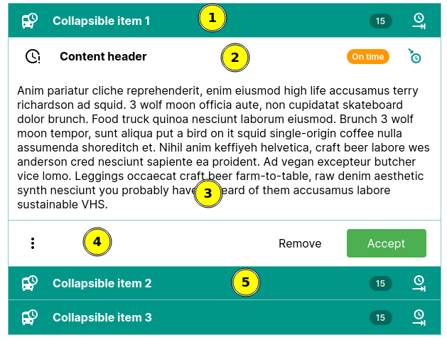
- Accordion panel header, the header is a NavBar.
- Accordion panel content header, this is also a NavBar.
- Accordion panel body.
- Accordion panel footer. this is also a NavBar.
- Collapsed accordion panel.
Examples
Collapse strategies Different ways to expand/collapse an element.
Accordion Group collapsed panels
Accordion Multi-open Accordion can have multiple panels open at the same time.
API Docs: Collapsible
Constructors
public void Collapsible(Element element)
element
HTMLElement to be wrapped in a collapsible
Static methods
public static Collapsible create(Element element)
element
HTMLElement to be wrapped in a collapsible
Returns:
a Collapsible object
public static Collapsible create(IsElement<?> isElement)
isElement
IsElement to be wrapped in a collapsible
Returns:
a Collapsible object
Public methods
public boolean isForceCollapsed()
Returns:
boolean, if true the element is hidden and will not be shown even if we call expand
public Collapsible setForceCollapsed(boolean forceHidden)
forceHidden
boolean, if true it will hide the element if it is visible and will not allow the element to be shown unless it is turned off, when turned off the element will remain hidden until we call expand
Returns:
same instance
public Collapsible expand()
Make the element visible and call any attached show handlers
public Collapsible collapse()
Make the element hidden and call any attached hide handlers
public boolean isCollapsed()
checks if the wrapped element is collapsed
public Collapsible toggleCollapse()
toggle the element visibility, if its visible it hides it, otherwise it make it visible
public Collapsible toggleCollapse(boolean state)
toggle the element visibility based on the flag.
public Collapsible addCollapseHandler(CollapseHandler handler)
handler
Returns:
same Collapsible instance
public Collapsible addBeforeCollapseHandler(CollapseHandler handler)
handler
Returns:
same Collapsible instance
public void removeCollapseHandler(CollapseHandler handler)
handler
public void removeBeforeCollapseHandler(CollapseHandler handler)
handler
public Collapsible addExpandHandler(ExpandHandler handler)
handler
Returns:
same Collapsible instance
public Collapsible addBeforeExpandHandler(ExpandHandler handler)
handler
Returns:
same Collapsible instance
public void removeExpandHandler(ExpandHandler handler)
handler
public void removeBeforeExpandHandler(ExpandHandler handler)
handler
public CollapseStrategy getStrategy()
public Collapsible setStrategy(CollapseStrategy strategy)
strategy .
strategy
CollapseStrategy to be used with this collapsible
Returns:
same Collapsible instance
public Element element()
API Docs: CollapsibleHandlers
Public methods
public abstract Runnable onBeforeExpand()
public abstract Runnable onExpandCompleted()
public abstract Runnable onBeforeCollapse()
public abstract Runnable onCollapseCompleted()
API Docs: CollapsibleStrategy
Public methods
public default void init(Element element, CollapsibleHandlers handlers)
element
The collapsible Element
handlers
a CollapsibleHandlers object
public abstract void expand(Element element)
element
The collapsible Element
public abstract void collapse(Element element)
element
The collapsible Element
public default void cleanup(Element element)
element
The collapsible Element
API Docs: AnimationCollapseOptions
Public methods
public Transition getShowTransition()
public AnimationCollapseOptions setShowTransition(Transition showTransition)
showTransition
Returns:
Same AnimationCollapseOptions instance
public Transition getHideTransition()
public AnimationCollapseOptions setHideTransition(Transition hideTransition)
hideTransition
Returns:
Same AnimationCollapseOptions instance
public CollapsibleDuration getShowDuration()
public AnimationCollapseOptions setShowDuration(CollapsibleDuration showDuration)
showDuration
The duration, one of enums provided byt CollapsibleDuration
Returns:
Same AnimationCollapseOptions instance
public CollapsibleDuration getHideDuration()
public AnimationCollapseOptions setHideDuration(CollapsibleDuration hideDuration)
hideDuration
The duration, one of enums provided byt CollapsibleDuration
Returns:
Same AnimationCollapseOptions instance
public int getShowDelay()
Returns:
An int number representing the delay in milliseconds to wait before show/expand animation is started after we show/expand the element.
public AnimationCollapseOptions setShowDelay(int showDelay)
showDelay
The delay in milliseconds
Returns:
Same AnimationCollapseOptions instance
API Docs: Accordion
Constructors
public void Accordion()
Static methods
public static Accordion create()
Returns:
new Accordion instance
Public methods
public Accordion appendChild(AccordionPanel panel)
panel
The AccordionPanel to be added
Returns:
same accordion instance
public Accordion appendChild(AccordionPanel[] panels)
panels
The AccordionPanel s to be added
Returns:
same accordion instance
public Accordion insertChild(int index, AccordionPanel panel)
index
The index to insert the panel at, if the index is less than 0 or greater than the number of panels it will be appended to the end of the accordion
panel
The AccordionPanel to be inserted
Returns:
same accordion instance
public Accordion togglePanel(AccordionPanel panel)
panel
The AccordionPanel to be toggled
Returns:
same accordion instance
public Accordion collapseAll()
Returns:
same accordion instance
public Accordion expandAll()
Returns:
same accordion instance
public Accordion multiOpen()
Returns:
same accordion instance
public boolean isMultiOpen()
Returns:
a boolean, true if multiple opened panels enabled, false if multiple opened panel is disabled
public Accordion setMultiOpen(boolean multiOpen)
multiOpen
a boolean, true enables open multiple panels, false disable open multiple panel.
Returns:
a Accordion object
public Accordion setPanelCollapseStrategy(Supplier<CollapseStrategy> strategy)
strategy
The CollapseStrategy to use when the accordion panels are collapsed/expaned
Returns:
Same accordion instance
public List<AccordionPanel> getPanels()
API Docs: AccordionPanel
Constructors
public void AccordionPanel()
public void AccordionPanel(String title)
title
The title text
Static methods
public static AccordionPanel create(String title)
title
The title text
Returns:
new Accordion instance
Public methods
public AccordionPanel appendChild(PostfixAddOn<?> element)
element
The element or component wrapped as a postfix.
Returns:
Same AccordionPanel instance
See also :
public AccordionPanel appendChild(HeaderContent<?> element)
element
The component or element wrapped as a HeaderContent
Returns:
Same AccordionPanel instance
See also :
public AccordionPanel appendChild(FooterContent<?> element)
element
The component or element wrapped as a FooterContent
Returns:
Same AccordionPanel instance
See also :
public AccordionPanel setTitle(String title)
title
The accordion panel header title
Returns:
same AccordionPanel instance
public AccordionPanel withTitle(String title)
title
The accordion panel header title
Returns:
same AccordionPanel instance
public AccordionPanel withHeader(ChildHandler<AccordionPanel, NavBar> handler)
handler
The ChildHandler applying the customizations
Returns:
same AccordionPanel instance
See also :
public NavBar getHeader()
Returns:
The NavBar representing the panel header
public AccordionPanel setIcon(Icon<?> icon)
icon
The Icon to be used in the panel header
Returns:
Same AccordionPanel instance
public AccordionPanel withIcon(Icon<?> icon)
icon
The Icon to be used in the panel header
Returns:
Same AccordionPanel instance
public DivElement getContentBody()
public AccordionPanel withContentBody(ChildHandler<AccordionPanel, DivElement> handler)
handler
The ChildHandler applying the customizations
Returns:
same AccordionPanel instance
See also :
public DivElement getContent()
public AccordionPanel withContent(ChildHandler<AccordionPanel, DivElement> handler)
handler
The ChildHandler applying the customizations
Returns:
same AccordionPanel instance
See also :
public NavBar getContentHeader()
public AccordionPanel withContentHeader(ChildHandler<AccordionPanel, NavBar> handler)
handler
The ChildHandler applying the customizations
Returns:
same AccordionPanel instance
See also :
public AccordionPanel withContentHeader()
Returns:
Same AccordionPanel instance
public NavBar getContentFooter()
public AccordionPanel withContentFooter(ChildHandler<AccordionPanel, NavBar> handler)
handler
The ChildHandler applying the customizations
Returns:
same AccordionPanel instance
See also :
public AccordionPanel withContentFooter()
Returns:
Same AccordionPanel instance